The Impact of Colour Choices by Commercial Painters on Barrie’s Cityscape
When it comes to the visual appeal of a city, few factors have as much influence as the colours used in its buildings. The choice of colours by commercial painters can significantly impact the overall aesthetic of a cityscape. In the case of Barrie, a vibrant and growing city in Ontario, Canada, the colour choices made by commercial painters play a crucial role in shaping the city’s identity and creating a welcoming atmosphere for residents and visitors alike.
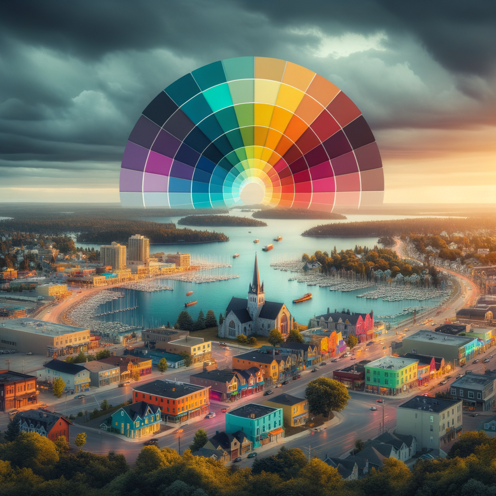
The Psychology of Colour
Before delving into the impact of colour choices on Barrie’s cityscape, it is essential to understand the psychology behind colours. Different colours evoke different emotions and have varying effects on individuals. For example:
- Red: Often associated with energy, passion, and excitement, red can create a sense of urgency and draw attention.
- Blue: Symbolizing calmness, trust, and stability, blue is often used to create a sense of tranquility.
- Yellow: Known for its association with happiness and optimism, yellow can create a cheerful and welcoming atmosphere.
- Green: Representing nature and growth, green can create a sense of harmony and relaxation.
- Orange: Combining the energy of red and the cheerfulness of yellow, orange can create a vibrant and enthusiastic atmosphere.
- Purple: Often associated with luxury and creativity, purple can create a sense of elegance and sophistication.
These are just a few examples of how colours can influence our emotions and perceptions. Commercial painters in Barrie must consider these psychological effects when choosing colours for their projects.
The Importance of Colour Choices in Barrie’s Cityscape
Barrie is a city known for its natural beauty, with its stunning waterfront and picturesque landscapes. The colour choices made by commercial painters in Barrie can either enhance or detract from the city’s natural charm. Here are some key reasons why colour choices matter:
1. Creating a Sense of Identity
The colours used in Barrie’s cityscape contribute to the city’s overall identity. By using colours that reflect the city’s history, culture, and values, commercial painters can help create a unique and recognizable identity for Barrie. For example, incorporating shades of blue and green can pay homage to the city’s proximity to Lake Simcoe and its surrounding natural landscapes.
2. Enhancing Architectural Features
Colour choices can highlight and enhance the architectural features of buildings in Barrie. By using contrasting colours or accentuating specific details with bold colours, commercial painters can draw attention to the unique aspects of each building. This not only adds visual interest but also showcases the city’s architectural diversity.
3. Influencing Mood and Atmosphere
The colours used in Barrie’s cityscape can have a significant impact on the mood and atmosphere of the city. Bright and vibrant colours can create a lively and energetic atmosphere, while softer and more muted tones can evoke a sense of tranquility. Commercial painters must consider the desired mood and atmosphere when choosing colours for their projects.
4. Attracting Tourism and Investment
Barrie is a popular tourist destination and a thriving economic hub. The colours used in the cityscape can play a role in attracting tourists and encouraging investment. Vibrant and visually appealing colours can make the city more attractive to visitors and potential investors, contributing to its economic growth.
Case Studies: Successful Colour Choices in Barrie
Several examples in Barrie demonstrate the positive impact of well-chosen colours in the cityscape. These case studies highlight the successful use of colour choices by commercial painters:
1. The Spirit Catcher
The Spirit Catcher, a prominent sculpture located on Barrie’s waterfront, is a prime example of the impact of colour choices. The sculpture’s vibrant red colour creates a striking contrast against the blue backdrop of Lake Simcoe, making it a focal point of the cityscape. The bold colour choice adds visual interest and enhances the overall aesthetic appeal of the waterfront area.
2. Downtown Heritage Buildings
The heritage buildings in Barrie’s downtown core showcase the city’s rich history and architectural heritage. Commercial painters have successfully preserved and enhanced these buildings by using colours that complement their architectural style. Soft pastel shades and earthy tones create a cohesive and visually pleasing streetscape, attracting both locals and tourists.
The Role of Commercial Painters in Barrie’s Cityscape
Commercial painters in Barrie play a vital role in shaping the city’s visual landscape. Their expertise in colour selection and application techniques can transform buildings and contribute to the overall aesthetic appeal of the city. By understanding the unique characteristics of Barrie and its residents, commercial painters can make informed colour choices that align with the city’s identity and create a positive impact.
Frequently Asked Questions about ‘The Impact of Colour Choices by Commercial Painters on Barrie’s Cityscape’
1. How do commercial painters choose colours for their projects?
Commercial painters consider various factors when choosing colours, including the building’s purpose, architectural style, surrounding environment, and the desired mood or atmosphere. They also take into account the preferences and expectations of the building owner or client.
2. Can colour choices affect property values in Barrie?
Yes, colour choices can impact property values in Barrie. Well-chosen colours that enhance the overall aesthetic appeal of a building can increase its desirability and potentially raise its value. On the other hand, poor colour choices that clash with the surrounding environment or architectural style may have a negative impact on property values.
3. Are there any regulations or guidelines for colour choices in Barrie?
Barrie does not have specific regulations or guidelines for colour choices in its cityscape. However, commercial painters are encouraged to consider the city’s heritage and architectural character when selecting colours. They should also comply with any applicable building codes and regulations.
4. How can commercial painters stay updated on colour trends?
Commercial painters can stay updated on colour trends by following industry publications, attending trade shows and conferences, and engaging with paint manufacturers. They can also seek inspiration from other cities and collaborate with interior designers or colour consultants.
5. What is the role of technology in helping commercial painters visualize colour choices?
Technology plays a significant role in helping commercial painters visualize colour choices. Paint manufacturers offer digital tools and software that allow painters to digitally apply different colours to images of buildings. This helps them and their clients make informed decisions and visualize the final result before starting the painting process.
Conclusion
The impact of colour choices by commercial painters on Barrie’s cityscape cannot be underestimated. The colours used in buildings contribute to the city’s identity, enhance architectural features, influence mood and atmosphere, and attract tourism and investment. By making well-informed colour choices, commercial painters can transform Barrie’s cityscape into a visually appealing and welcoming environment for all. The careful consideration of colours and their psychological effects is crucial in creating a vibrant and harmonious cityscape that reflects the unique character of Barrie.
Call-to-Action
If you’re looking for professional commercial painters in Barrie who understand the importance of colour choices, contact Painters Barrie today. Our team of experienced painters can help bring your vision to life and create a cityscape that leaves a lasting impression.
