How to Choose the Right Colours for Your Commercial Space Using Colour Psychology
Choosing the right colours for your commercial space is more than just a matter of personal preference or aesthetics. The colours you choose can have a significant impact on the mood, productivity, and overall experience of your customers and employees. This is where colour psychology comes into play. By understanding the psychological effects of different colours, you can create a space that not only looks visually appealing but also enhances the desired emotions and behaviors.
The Power of Colour Psychology
Colour psychology is the study of how colours affect human behavior and emotions. It explores the psychological and physiological responses that people have to different colours. By understanding these responses, you can strategically use colours to create specific atmospheres and influence the perception of your commercial space.
Research has shown that colours can evoke different emotions and behaviors. For example, warm colours like red, orange, and yellow are known to stimulate energy, excitement, and appetite. On the other hand, cool colours like blue and green are associated with calmness, relaxation, and focus. By carefully selecting the right colours for your commercial space, you can create an environment that aligns with your brand identity and desired customer experience.
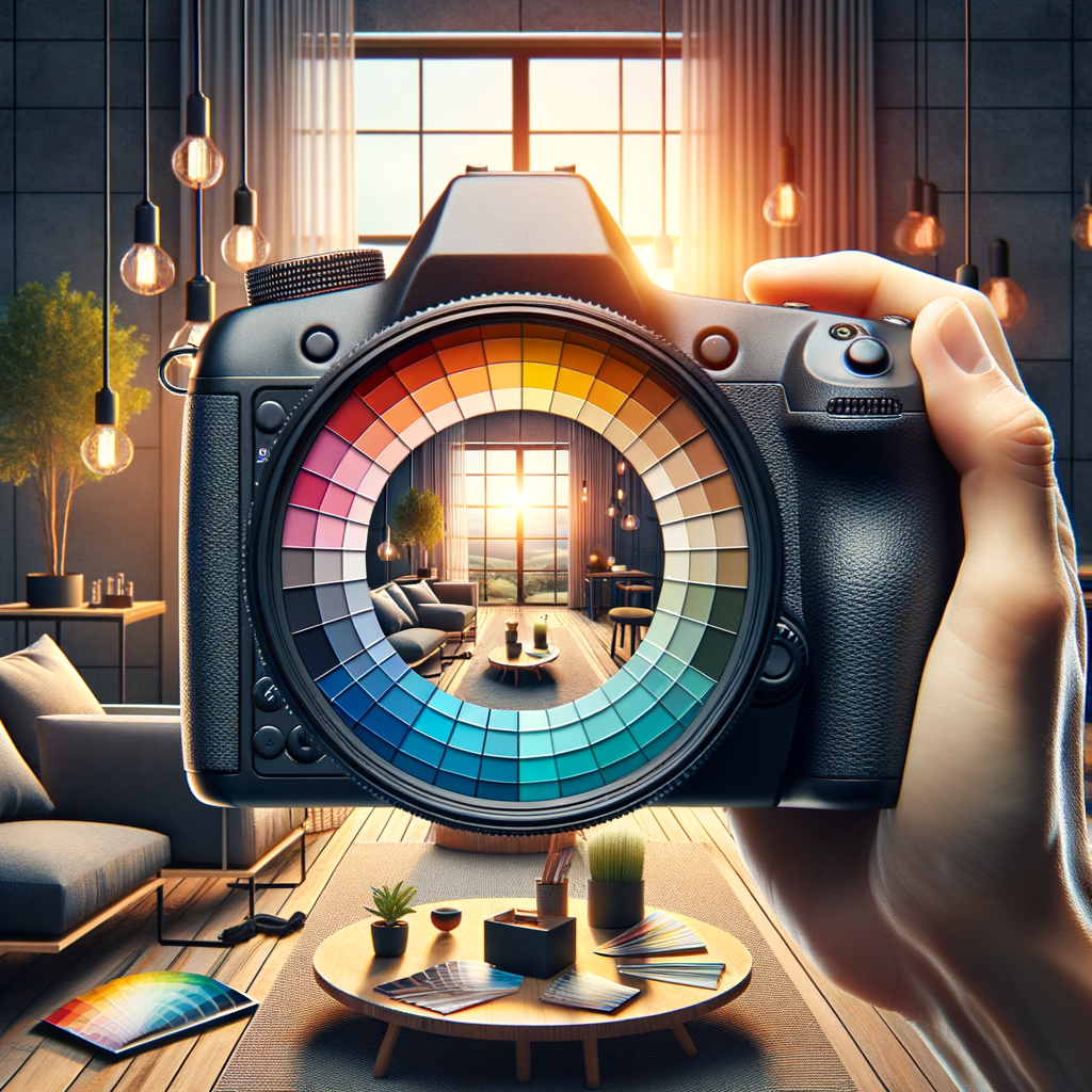
Understanding the Colour Wheel
Before diving into the specifics of colour psychology, it’s important to have a basic understanding of the colour wheel. The colour wheel is a visual representation of the relationships between different colours. It consists of primary colours (red, blue, and yellow), secondary colours (orange, green, and purple), and tertiary colours (a combination of primary and secondary colours).
Using the colour wheel, you can create colour schemes that are visually appealing and harmonious. Some common colour schemes include:
- Monochromatic: Using different shades and tints of a single colour.
- Analogous: Using colours that are adjacent to each other on the colour wheel.
- Complementary: Using colours that are opposite each other on the colour wheel.
- Triadic: Using three colours that are evenly spaced on the colour wheel.
Each colour scheme has its own unique effect and can be used to create different atmospheres in your commercial space. For example, a monochromatic colour scheme can create a sense of harmony and simplicity, while a complementary colour scheme can create a vibrant and energetic atmosphere.
Applying Colour Psychology to Your Commercial Space
Now that you have a basic understanding of colour psychology and the colour wheel, it’s time to apply this knowledge to your commercial space. Here are some key considerations to keep in mind:
1. Understand Your Brand Identity
Before choosing colours for your commercial space, it’s important to understand your brand identity and the emotions you want to evoke. Consider your brand values, target audience, and the overall message you want to convey. For example, if you run a spa or wellness center, you may want to create a calming and relaxing atmosphere, which can be achieved through the use of cool colours like blue and green.
2. Consider Your Target Audience
It’s essential to consider your target audience when choosing colours for your commercial space. Different demographics may have different preferences and emotional responses to colours. For example, younger audiences may be more drawn to vibrant and bold colours, while older audiences may prefer more muted and traditional colours. Understanding your target audience can help you create a space that resonates with them and enhances their experience.
3. Create a Hierarchy of Spaces
Consider the different areas within your commercial space and create a hierarchy of spaces. This means assigning different colours to different areas based on their function and desired atmosphere. For example, you may want to use warm and energetic colours in areas where you want to stimulate activity and engagement, such as waiting areas or product displays. On the other hand, you may want to use calm and soothing colours in areas where you want to promote relaxation and focus, such as meeting rooms or meditation spaces.
4. Test and Iterate
Choosing the right colours for your commercial space is not a one-size-fits-all approach. It’s important to test different colours and gather feedback from your customers and employees. Conduct surveys or focus groups to understand their emotional responses and preferences. This feedback can help you make informed decisions and iterate on your colour choices to create the desired atmosphere.
Case Study: The Impact of Colour Psychology on Retail Spaces
Colour psychology has been widely used in retail spaces to influence customer behavior and drive sales. Let’s take a look at a case study that demonstrates the impact of colour psychology on retail spaces.
In a study conducted by the Pantone Color Institute, it was found that the use of warm colours like red and orange in retail spaces can increase customer excitement and stimulate impulse buying. These colours create a sense of urgency and energy, encouraging customers to make quick purchasing decisions. On the other hand, cool colours like blue and green were found to create a more relaxed and contemplative atmosphere, which can be beneficial in areas where customers need to spend more time making considered purchases.
Based on these findings, many retailers have strategically used warm colours in areas where they want to promote impulse buying, such as near checkout counters or in promotional displays. They have also used cool colours in areas where they want to encourage browsing and contemplation, such as in fitting rooms or seating areas.
Frequently Asked Questions about ‘How to Choose the Right Colours for Your Commercial Space Using Colour Psychology’
1. How do I choose the right colours for a professional office space?
When choosing colours for a professional office space, it’s important to strike a balance between professionalism and creativity. Neutral colours like gray, beige, or white can create a clean and professional atmosphere, while pops of vibrant colours can add energy and creativity. Consider the nature of your business and the desired atmosphere you want to create.
2. Can colours affect employee productivity?
Yes, colours can have a significant impact on employee productivity. Research has shown that certain colours can enhance focus, creativity, and motivation. For example, blue has been found to stimulate productivity and focus, while green can promote a sense of calmness and relaxation. Consider incorporating these colours in areas where employees need to concentrate or brainstorm.
3. How can I use colours to create a welcoming atmosphere in a restaurant?
To create a welcoming atmosphere in a restaurant, consider using warm colours like red, orange, or yellow. These colours can stimulate appetite and create a sense of excitement. Additionally, consider using softer lighting and warm-toned accents to enhance the cozy and inviting atmosphere.
4. Are there any colours I should avoid in a healthcare setting?
In a healthcare setting, it’s generally best to avoid bright and intense colours that can be overstimulating or create a sense of anxiety. Instead, opt for calming and soothing colours like blues and greens. These colours can create a sense of tranquility and promote a healing environment.
5. How can I incorporate branding colours into my commercial space?
Incorporating branding colours into your commercial space can help reinforce your brand identity and create a cohesive experience. Consider using your branding colours in key areas such as signage, logos, or accent walls. You can also use these colours in smaller details like furniture, artwork, or accessories to create a subtle and consistent brand presence.
Summary
Choosing the right colours for your commercial space is a strategic decision that can have a significant impact on the overall experience of your customers and employees. By understanding the principles of colour psychology and considering factors such as brand identity, target audience, and desired atmosphere, you can create a space that not only looks visually appealing but also enhances the desired emotions and behaviors. Remember to test and iterate on your colour choices and gather feedback to ensure that your commercial space creates the desired impact.
Call-to-Action
Ready to transform your commercial space with the power of colour psychology? Contact Painters Barrie today for expert advice and professional painting services. Let us help you create a space that reflects your brand identity and enhances the desired customer experience.
